Topaz Studio 2: Introduction and Workflow for Beginners
introduction and workflow tutorial -> | Introduction |
01 |
02|
03 |
04 |
05 |
06 |
07 |
08 |
09 |
10 |
| digital painting examples |
resources |
about |
impressionist painters
| contact-questions |
Part 4: Exploring the "Add Look" presets & gathering "favourites"
Have a brief look at the presets by clicking on "Add Look" (that's where they live waiting to do their magic). Let's figure out how to get a hold on some of that potential magic.
After showing you around the presets and how I initially use them and collect favourites, we'll shift on the next pages to the Impression filter. Most, but not all "impressionist" looks rely on two filters, "impression" and "abstraction". So in Part 5 we'll have a close look at those filters.
However, because TS promotions promise so much, to wit, in one click you can create an artisticl ditigal image, it’s worth pausing to have a close look at the “Add Look” presets ... and, importantly, while you're doing it, to begin to gather favourite presets in yur TS tool kit.
To see the presets click on “Add look” and you’ll get something like this:
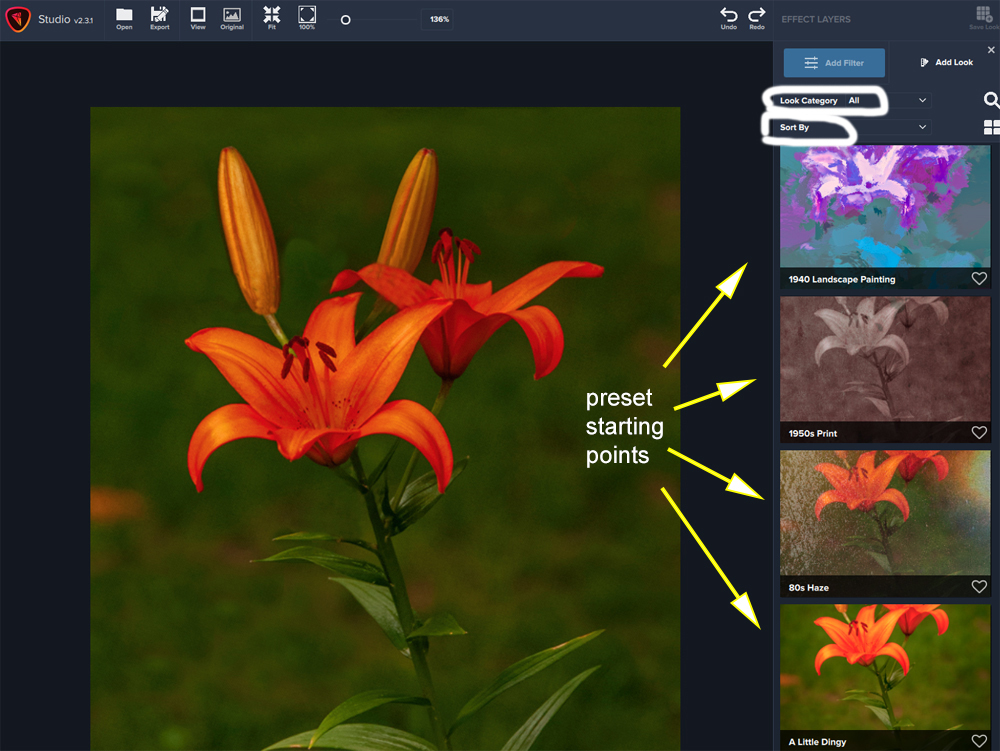
You'll find there are a lot of presets. Think of them as starting points for producing a painting-like digital image. Each one can look quite different than what you initially see as you work further with it.
That said, because I'm looking for presets that might lead to an impressionist look, and not a drawing or creatively colored wild abstract look, I tend to select any that seem promising. For example in the initial ones shown above, "A Little Dingy" could be one of my possible starting points.
Note the small heart to the right of "A Little Daisy." Click on it and it will fill in and become one of your favourites. You may as well start collecting favourites preset looks now, because it will save you a lot of time focusing in on presets that appeal to you as places where with more work, you might take your photo soon to become some kind of digital painting.
So spend some time browsing through them, and as you run your cursor over them, you can have a look at what they initially do to your image. Remember, you can adjust these starting points dramatically. They are NOT end points in your mission to create an eye candy, impressionist-like or any other kind of digital painting image.
If you've spotted any that you like, not so much as the final perfect digital painting look you want, but as a reasonable starting point, and have clicked on a few hearts, I'll show you how to get to your heart throbs (aka favorite looks, aka promosing presets, aka starting points) a bit later.
Next, let's selectivel explore the "Add Look" presets selection categories. You'll see two drop down menus: "Look Category" and "Sort by".
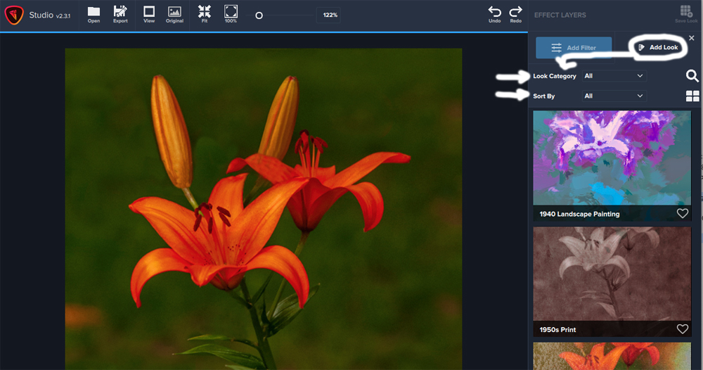
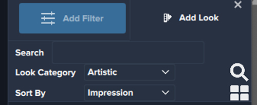
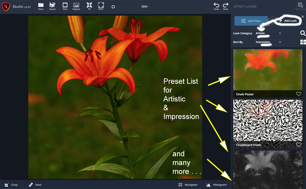
In the Look category list select "Artistic" and in the "Sort By" category list select "Impression".
This will produce a different set of presets (looks) that are more closely akin to impressionist-like painting looks. (but not all of them will look that way). These too are simply starting points and few are likely to produce a final "impressioist painting" look satisfying to your eyes when you click on it. Scoll through them and see if you can find any worthy starting points, and don't forget to click on the "heart" to add them to your favourites list.
After doing this, here's my list of favourites. I've gotten there by changing the Look Category and Sort by Category to "Favourites" and "All". Note that the list is alphabetical. Further down, preset names related to the impressionist painters like Degas, Monet and Cezanne came up. However, these abstract presets can also be used as starting points for creating an impressionist watercolor look. And while Abstraction I and II look a bit more like abstracts, even these can be worked with to produce a pleasing final digital painting image.

Why not check out your favourites at this point? Or if you were a bit cautious and didn't click on any hearts = favourites, scroll through and click on some and then check your favourites list. It's a good practice and you can always easily eliminate any favourites that you later want to drop.
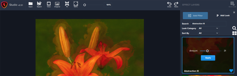
There's one more important move to be made when you're scoutng for favourite statrting points. You might not understand why I've clicked on the hearts for those two awful blobs of colour, Abstraction II and III. Before you give up on them, try this:
1. click on the magnifying glass and search for "Abstraction III".
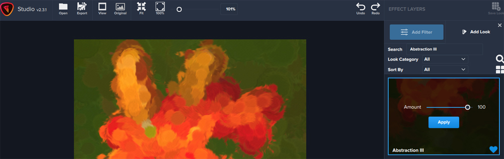
2. Don't click on "apply". Instead move the "amount" slider to the left to see what happens to the orange blob when its effect is reined in a bit. Here's what I get and why I've decided to click on the heart. Note my slider setting is 31.
In the next session, we'll focus on the "Impression" filter because it's the most used filter to create impressionist type digital images.