Topaz Studio 2: Introduction and Workflow for Beginners
introduction and workflow tutorial -> | Introduction |
01 |
02|
03 |
04 |
05 |
06 |
07 |
08 |
09 |
10 |
| digital painting examples |
resources |
about |
impressionist painters
| contact-questions |
Part 2: Preparing a photograph for TS2 work
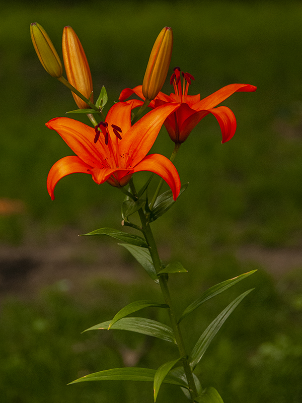
For purposes of this tutorial, i sugget you download and use my tigerlily image. I that way you can follow along and see whether you're getting to the effects that i'm aiming at. It's the one on the upper left which has been processed for use in Topaz Studio.
When you decide to try one of your own images, I assume that you've already post processed it so that it looks good as a photographic image. Pick an image that has a promising composition and color tones but isn't very complicated. The tigerlily image works well because it has only two distinct shapes, the flower and the background.
Here are two suggestions for preparing an image:
Declutter the image. If you select one of your own flower shots but clean up the background and flower(s). Images with lots or sky and/or water and multiple shapes and colours are best reserved for later work because each area will likely require separate treatments. In short, keep to a simple image initially and clean out all unnecessary detail. You might also reduce noise.
Deintensify the image: Cut down on tonal range, highlights and darks, and saturation. Many impressionist paintings have a tonal range from about 3 to 7 on a scale of 1 = dark/black to 10 = bright/white. Thus consider shifting the tone curve (histogram) from one that covers the complete range from dark to light to one that falls in the middle of the histogram. You can do this by reducing highlights and pure dark/black areas. Also consider reducing the sharpness of your or at least not improving it.
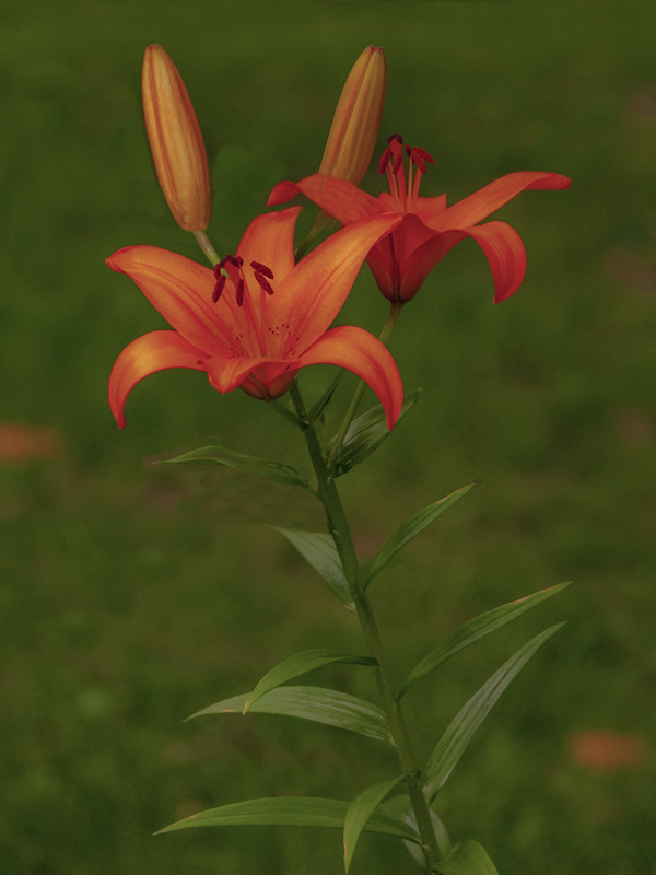
To show you what I mean, the original tigerlily image is on the left, and the prepared version is on the right. Note that I've cloned out the distracting background at top and middle, eliminated the left side bud, moved a lily leaf ahead of the bud on the right, dimmed down the contrast and sharpness. In the field, I was unable to set the shot up for the light in the right place without some of those distracting details showing.
 |
 |
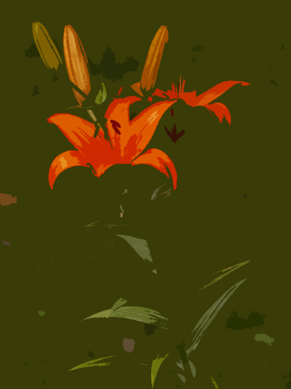
In terms of simplification of shapes/forms, I've used the "cutout" filter in photoshop to help see the image in the way a painter might. note that the image has two key shapes: The flower and leaves where all the detail will be contained and the background.
In making these simplification changes, keep in mind that once you’ve created a painting look in TS, you can later increase the tonal range, contrast, saturation and sharpness on your digital paiinting version.
And now that you have an image prepared for use, the tigerlily or one of yours, let's use the image to learn about the TS interface and how its presets and filters work.